Showing posts with label Rotating Filler Cards. Show all posts

Monday, March 5, 2018

Mighty Morphin Overlay Users...

I don't know how many of you are still reading this little blog of mine (I'm gonna let it shine!), but here's another example of a paper scrapbook page that I'd 90% finished with....except the journaling, and how I 100% finished it up as a Project Life app page.

Let's start off with the BEFORE:


Nothing fancy, just some matted photos and some room left for eventual journaling (we all know how that turned out!)

So the first thing I noticed was that there are three vertical photos. There wasn't any photo that I'd necessarily want on an app page that was bigger than the others, so that limited me to looking for a template that would have three same-sized vertical pockets.


Since there was three photos, I wanted to space them across the page, and I knew that I wanted the other three spaces for journaling. Template Design L fit the bill!


I knew that I wanted a dark green background for those journaling cards. So in a break from tradition, for this page I actually put in the blank green journaling cards (from the Soccer Edition set) first, and then added the photos.


The reason I chose the three blank green journaling cards was because I spent (probably too much) time going through all the card sets I owned looking for a card that I liked that had some kind of dark green element on it--a frame, some kind of design, etc. And I didn't like ANYTHING. So then I thought about just using a plain green card and then adding an overlay.

I found some white diagonal lines in the Just Add Color Photo Overlays set. So I added the overlay on top of the green card, and then typed my journaling. I had to left justify the text, and manually put in some hard returns to fill the space without overlapping the overlay.


I really liked how the diagonal lines were on the left side of the bottom picture, and wanted to mirror that on the other side. For this I had to save what I had so far on the page, and then recreate the green card using the Collage feature of the PL app. I don't know if you all have played around with this feature, so I'm just going to talk you through my process as if you haven't. :)

On the PL app homescreen, I tapped the orange section, and that brought up my default collage template. I knew that the slot on my page was a vertical 4x6 slot, so I tapped the grid button on the top left of the app to bring up the collage templates. I picked the 4x6 B template.


Then I put in the same blank green journaling card, and added the same diagonal line overlay on top of it. Then I exported that whole card as an image to my camera roll.

Next, I pulled up my page in progress again, and in the bottom right card slot I pulled in the collage I just created as an image. Once it was in the slot, I tapped the button on the top left (the button with the three slider bars--does this have an official name?) and that brought up the options for changing the brightness, saturation, etc--but most importantly, the option to rotate.

I rotated it two tap's worth (180 degrees) so that the diagonal lines were now on the left, closest to my photo.


A little snag at this point in the process. Since I brought in that card as a photo, I couldn't journal on it in the PL app. So I ventured out of the app entirely and opened up the photo from my camera roll in the LetterGlow app. I knew that the card would eventually be set on my finished page with the diagonal lines on the left, so if I were to add my journaling text, I'd have to do it upside down here in LetterGlow and then pull the card in as a photo again and rotate it. Whew, talk about outside the box thinking!


So I added my text (they have the Amatic font which I use in my PL pages, so that was a score for consistency!), and I turned it upside down using the tools in LetterGlow. Then I saved this new card to my camera roll, and went back into the PL app and pulled it in as a photo again.


Then it was another quick rotation for that card, and a few seconds to add larger text to the remaining journal card as a title, and BAM! Another paper scrapbook page completed as an app page!


Thursday, February 22, 2018

Recreating a Page...and Rotating a Filler Card

I don't know that there is anyone who really reads this, but it's a project that keeps me busy regardless.

I have now gone to my local FamilySearch center the last three weeks and scanned hundreds of paper scrapbook pages, resulting on thousands of individual images that I am SLOWLY working to re-scrapbook in the Project Life app.

Some may think it's a waste of my time to redo what has been done. Well, that's just it. It's MY time. And I want to spend it making scrapbook pages the way I want them.

I've said before that I wasn't fully satisfied with how the paper pages looked, and how incomplete they were because of the missing journaling that I would someday come back and add. Well, today is SOMEDAY, and I'm adding that journaling...and just happen to be tweaking the pages and making the digital at the same time.

Here's the latest example of a page I converted.


The original page wasn't half bad. I had picked a color scheme that matched the photos. I was even a little artsy in making a cardstock patchwork pattern out of different shades of blue to mimic the denim quilt in the pictures. And there's the title that I stamped with rubber stamps and then colored in with markers. And can we just talk about what a big fan I was of tilting the pictures as I glued them on the page? Oh, yeah, I was all about that.

But..... no journaling. What year did this happen? Who made the quilt?

So in my quest to digitize the page, I knew a couple of things. If possible I wanted to keep the stamped title of the page intact. I knew I wanted to keep the red and blue color scheme. I knew I wanted to add the journaling.

So for this page (and it doesn't always happen this way for me), I started looking for a template first. I knew I had two pictures that I'd want in big slots, and that my title would probably have to be split into three smaller, vertical oriented slots.

I ultimately decided on the Design S template. I could use the smaller vertical slots for the title, the other small slots for filler cards, and the bigger slots for my pictures and journaling.


From there it was just a matter of pulling in the various elements and adding the journaling.


Since I liked the red and blue theme, I picked the Americana card set for my filler cards. I probably spent more time "testing" cards in the slots than it took to make the page altogether....the paper way! I would pull in pattered card in the top slot, then add a second, different patterned card in the middle slot, and then back out and look at the page as a whole.  Nope. Didn't like how the two patterns clashed, or didn't like those colors next to each other.

Finally I decided I liked the idea of striped cards. The narrow blue stripes and the thicker multicolored stripes. But.... the narrow blue striped cards were horizontal and on the thicker striped card, the stripes were vertical.

I lucked out, though. This isn't the case with every filler card in the different PL app sets, but I could actually rotate the orientation of the thick striped card within the app. I don't know if you have ever tried rotating a filler card before, but here's how to do it (or see if it's even an option to do).


Pull in the filler card you want to use, into the slot you want. Then click on that card slot so that it is "selected" and it sort of zooms in on your phone screen. Here's you'll see the Add Photo or Add Card buttons you are used to seeing. But in the opposite corner, if the card is able to be rotated, there will be the Rotate button. Like I said, not all cards will have this option, and some cards that do have this option will, when rotated, shrink or stretch the card image slightly. You'll just have to play with it and see if you like it.

Some cards may look better if you rotate them 90 degrees (one tap of the Rotate button), or it may look better if the pattern/design on the card was upside-down (180 degree rotation, or two taps of the Rotate button). Play around with it. Post your pages on Instagram. Tag me @projectlifeappdude  in the photo or the comments! You guys are so kind to me in the comments of things I post on Instagram, and I'd like to return the favor! Plus as much as I hope my pages inspire your creativity, I get ideas for things other people post just as much!

Anyway, that's it for this go around of taking scrapbook pages digitial.

Until next time! :)

Saturday, January 20, 2018

Finally Complete...It Only Took Me 18 Years!

Remember back in my first post where I talked about having paper scrapbook pages that were 80-90% finished except the journaling....and how I had actually taken the time to write (or type) out the journaling but hadn't taken the extra few minutes to actually glue it down on the page?

Here's a prime example right here:


It's soooo close to having been a completed page! I've got a million of pages like this people. That's part of the driving force behind why I'm trying to get things digital and made in the PL app--to have COMPLETE pages!

So here's how I went about finishing up this page once and for all. And better late than never seeing as how this kid in this picture is turning 20 this year! ;)

First, I scanned the page and saved it in Google Photos. For some reason, my scanner will scan individual parts of the page as separate images (I think it has to do with the white background and it thinking there are just pieces instead of a whole page image). So in Google Photos I actually have three images, one for each of the photos on the page. No big deal, those are the parts of the page I want to eventually pull into the app anyway.

So, I have three image to work with, and they are all vertically oriented, so I chose the Design X template, but cause I knew I wanted to feature the photos in a large slot, but also knew that I'd have a bit of journaling to write down, too.


I saved the three photos from Google Photos back onto my camera roll for easy access from the PL app, so I pulled those into three of the five large slots on the page.


I arranged the photos in a way that they show kind of a progression of the licorice-face mess. I wanted to also have a picture of some licorice to go with the page, but hadn't taken a photo of licorice back when this was all going down. 

So here's a little "cheat" I use sometimes. I go on a Google Image search. For those who haven't ever thought of this, you simply go to Google.com and then along the top of that main page, there should be a link for Images. Click that and anything you search for will come up with image results. So I did a search for "Red Vines licorice". Suddenly I have hundreds of images to choose from! The thing you have to be careful about is choosing a picture that is of good enough resolution so you can eventually print it without problems.

To solve this problem, when the search results come up, I look for a link towards the top of the page labeled Tools and click it. Then choose the Size option and click Large. This will limit the search results to just those with a large file size (and best resolution). Then I pick from those options and save the image I want to my camera roll.

But what about copyright? I figure that I'm not going to be making money off my pages, so I don't really worry about that. I'm not taking credit for being the photographer of the image or anything, I'm just using it for my own personal page. I don't lose any sleep over the pictures I "borrow" from Google Images.

Then I add that image to my remaining large card slot.


Now it's time for the journaling. I have a lot of blues and reds in my photos, and I remember that this all happened during the summer months, so I look through the Americana and Seasons Edition sets looking for red-white-blue cards. I like the options in the Seasons Edition the most, so from the 4x6 Journaling Card options, I pick a striped border card and add it to the remaining 4x6 slot, and add my journaling.


Then it's just the 3x4 slots to be filled. I look at the coordinating cards in the Seasons Edition set, and really like the one with the big star, so I add that to the bottom middle slot. But there isn't another filler card from that set that I like well enough to use in the last slot.  So I decide to just add the same star card in the last slot.....but with a twist....literally.


I pull the card into the slot, and then just rotate the image. Now, fair warning, not all filler cards will rotate in the PL app, it's all dependent on the size of slot the individual card was designed for. So have a back-up plan if the card you want won't rotate.

But luckily, this star card will rotate. So I tap the little rotate button and it rotates 90 degrees. I want it to be a mirror image of the other star card, so I rotate it another 90 degrees, and BAM! Another page done!  Well, except for deciding on if I like it with the blue, red, or white background the best! ;)


...and it only took me 18 years to finish! :)


Friday, January 12, 2018

Let's Get To It: Page 1

Some of the oldest pictures and pages I have are those few that I made of my old missionary days. These seem like as good a starting place for me as any.

First I needed to scan the old page. I thought about trying to scan each individual picture on the page separately, but there was a lot of tearing and wrinkling involved when I tried to get the pictures off the page. (Those glue sticks really packed a whallop!) So I just scanned the whole thing as a single image.

Brace yourself, it's not a pretty sight.


As you can see, it's just a really plain page, straight out of the 90s scrapbooking world! Three photos, a stenciled and handwritten title, and the most basic of journaling, I could work with this.

Once I scanned the photo, I saved it in a Dropbox folder. And from there uploaded it to my camera roll, to make pulling it into the Project Life app a little bit faster than having to go to Dropbox each time.

I have set up my PL Preferences to always start a new page with Template Design A. And since you can easily change templates at any time, why stress about that right out of the gate?


I'm a big believer that if there are big card slots on the template, I try and use those for my pictures first, since that's what I want to see most--the pictures.

From my camera roll, I quickly pulled in three copies of that one scanned page, and positioned each one of the pictures into a big slot, without any resizing. I just pulled them in.


At this point, I could see that I had two verticle and one horizontal pictures to work with. I began to  look through the available templates to try and find one that had at least that many slots (in the larger 4x6 size, and in those orientations).


I found that Design G had the orientation I wanted, but I didn't necessarily want all the extra space that design has around the edges. I also at this point started to pinch and zoom on the pictures to try and get them to fill the space, and what I discovered was, that even though I had a single, horizontal image, the subject of that photo (the MTC teacher) was what I wanted to focus on. I could make that work in a verticle space, so what I really wanted was a template with at least three vertical card slots.

I decided to keep the decisions to a minimum, and just went with Design D. So I got the pictures all settled it and sized the way I wanted them.


What my original paper page was missing was the depth of journaling I wanted, so I knew that I'd probably want the last large 4x6 space for journaling. I wanted to use a card without a lot of "design" elements that would eat up the journaling real estate on the card. Something that was maybe just a border design. I also knew that I wanted my color scheme to be black and white--it matched the shirts and slacks of the teachers in the photos, so that's what I looked for.

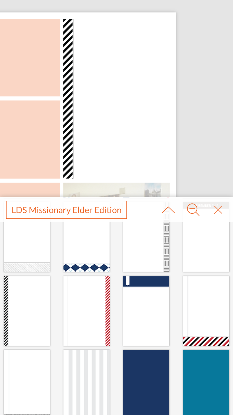
Turns out, the LDS Missionary Elder Edition card set was just what I was looking for. (Duh!) So I added a journal card to the last 4x6 opening.


Another of my Preferences in the app is to use the Amatic SC Bold font. I like it. It's masculine, relatively small, and thin. I referenced the original scrapbook page for what I had written there, and then expanded on it to make it more meaningful (you know, in case someone unfamiliar with me or my experiences were to read it). Once I had written everything I wanted to say, I center-justified it (my method of choice for journaling), enlarged the font size to fill the available space, then reduced the line spacing enough to squeeze the lines of text together a little bit more--so I could enlarge the font just a bit more to fill up as much space as possible, and be big enough for "old eyes".


So now I was left with those four 3x4 spaces on the template. As a general rule, I'm not overly fond of just putting in filler cards. I have to really love the card, the design, or pattern, and it has to really bring the whole page together for me. I looked through the filler cards in the Elder Edition set, and nothing really grabbed me. So again, I looked to my original page for inspiration.

M-T-C! I could use up three of the four slots with just those letters! I kept to the black and white theme and chose the letter cards from the ABC Themed-Black & White cards. There was a lot of white already in my journaling card, so I opted for the contrast.

But there was a little snag with that plan! When I tried to pull the ABC letter cards in, they weren't available in that orientation. Dang! So I went back to my templates, switched momentarily back to Design A (that did have the right orientation) and pulled the letters into that template. It messed up my other photos, but I would be switching back to Design D soon enough, so I wasn't super bugged.


Then I switched back to Design D, and there were the MTC letters, but they were facing the wrong direction! That's an easy fix in the app.

Letter cards were going the wrong way. Easy to fix!
I just had to click on each letter's card, and then tap the Rotate icon that was there. Tap the M card, rotate. Tap the T card, rotate. Tap the C card, rotate. Then I just tapped and dragged each letter card into the spot I wanted them.

Use the Rotate button to flip them around. 
Now we're cookin'! :)
Just one slot left to fill. I opted for the black theme again, and put in a solid black card from the same ABC set, and then added my journaling to that card in white. I enlarged the journaling to fill the space and....


...done. My first analog to digital scrapbook page, finished!


Next, I just had to save the finished product.

Here's how I go about saving my app pages: First, I tap the little upload button in the bottom right corner of the app, and select Export.

Then I select 12"x 12" image. (I pick this option because it will gives me the best resolution quality).


Dropbox is my backup program of choice, so I choose Save to Dropbox.


Dropbox opens and asks me to save the file. The PL app automatically gives the file a name (since I didn't name it something specific within the app). It's a weird filename with a bunch of numbers that represents the date the page was created, the words "project life", a string of random letters and numbers, and then the .jpg file extension since it's a picture file.


I always tap on this file name and change it. I always name my files with the year the page represents (in this case 1992) then a dash, then a short description of the page (MTC Teachers). Then I choose the folder location where I want the page to be saved. I have my Dropbox set up with year folders, so I either choose from the list of folders I've most recently used, or tap Choose a Different Folder, and find the one I want. Then I tap Save in the upper right corner and it saves.


Once it's saved, the PL app opens again, and I repeat the process of selecting the export icon, then Export, then instead of 12x12, I choose the Editable Backup option. I again choose to save in Dropbox, so I choose that option and it opens my Dropbox screen again. I rename the file using the same file name as when I saved the .jpg image, but notice that this time, the file extension is .plpage instead of .jpg--that's an easy way to distinguish whether you are saving the photo or the editable file. (Trust me, if you get in a rush or have been creating and backing up pages for a few hours, it all starts to blend together and you might not remember just which version you are working on!)

Once I've renamed the editable file, I make sure to select the same folder where the picture file was saved, and then tap Save.

At this point I will usually get out of the PL app, and open the Dropbox app independently just to double-check that things got actually got saved. Better safe than sorry because...


...once I determine that things are where they should be, I go back to the PL app and DELETE the page.

That might shock some people, but you see, my phone doesn't have a whole lot of storage space, so if I have backed-up both the page and the editable version, I feel like I can delete it from my app, because with that editable backup on Dropbox , I can always pull back in at any time if I need to.

So that's it. That's my process. As I create other pages in the future, I probably won't go into this much detail, but will try to at least share my "in progress" photos of how I'm taking those physical paper pages and transforming them digitally with the PL app, and share any shortcuts or ideas I have while doing it!