Showing posts with label Drop Shadows Off. Show all posts

Wednesday, June 27, 2018

Outside-the-Box Pages!

Hello there everyone! I'm back with another quick step-by-step to demonstrate another new trend in Project Life App scrapbooking - titles that span individual pockets! 

I first saw this technique used on a page that Jessica Andolsen posted on the App Scrappers-Simply Project Life Facebook group (hi Jessica!).

I played around a little bit and came up with my own page:

And here's how I created it:
*Disclaimer the thin grey bars in the following pictures at the top and bottom of the page, are just how I cropped the screenshots on my phone, and aren't part of the finished page.

I started off by choosing the Big Shot 3 template in the app, because I knew I wanted a single photo to be the focus of the page.

Big Shot 3 template. I'm pretty sure this is in a template pack that is an additional purchase within the app. But if you like big photos on your pages, this is worth the couple of bucks to purchase the pack!
Then, I pulled in an adorable (if i do say so myself) picture of some of my newly hatched ducklings into that largest pocket.


Then I filled in the pockets on the left side of the page with a solid color card. In my case, I used plain white cards from the Neutral Cards kit.

Solid white cards on the left. You could use any solid color, but you'll want to match it with your background color, and turn drop-shadow off if you want that "seemless" look.
Then I looked through a few different card kits until I found a journaling card that 1) was square (to go above my duck picture in that pocket), and 2) had a white background so it would blend in with the solid color cards I used in the step above. Then I put those cards (these are from the Project 12 June kit) into the two square pockets above the duck pic.


Next, I added my journaling onto the bottom left card, and positioned it towards the bottom of the card to get the overall look I was going for, and to leave room above it in the open white space for my title.


Okay. At this point I knew I wanted my title to be BIG and to not be confined to the pre-determined size of the cards slots on the left. So I saved the page as it was to my phone's camera roll. There's nothing special about the saving process. It's the same as if you are saving a completely finished page. Click the export button and then choose Export... 

Then select 12 x 12 image (so you get a high-quality version of the page)...


And then save the image to your phone.


So here's the steps that some of you may not have ever tried out before. It's a little "outside the box" thinking, which is totally appropriate because I want my page's title to expand OUTSIDE THE BOX!

Got to the Collage section of the Project Life app by clicking the orange section on the home screen.

Then select the collage template that is the single 12 x 12 square. Then, pull your exported page into the square as a photo from your camera roll.


The whole page comes in as a photo in a single piece through this process. There are no longer individual card slots. It's one "photo", which means you can use Free Form Text to write on it!


I wanted to use two different fonts and sizes for the title of the page, so I added a Free Form text box to the page, typed my title, changed my font/size/color and dragged (drug?) it to the spot on the page where I wanted it. In this case I wanted this first part of my title to only be in the white area of the page. (If you've never used Free Form Text before, or need a refresher, click and read THIS POST).


Now for a little creativity! For the bigger part of the title, I wanted a layered effect. Use another Free Form Text box and type your title out. Enlarge the font size and note what font size you use (because you'll want to duplicate this same size to get the layers to line up nicely).  Then, create a second title using the same font/size but choose a different coordinating color.


Decide which color title you want on the bottom, and tap and drag that title into place. I especially love this technique, because your titles no longer have to stay within the confines of a single card slot! They can even overlap onto your photos if you want them to! Once that bottom layer is in place, tap and drag the other colored title over the top, with just a slight overlap so you can still see the bottom layer.


And there you have it! A page that looks like a fancy, schmancy graphic designer created it, instead of (in my case) a fat, old guy in his pajamas laying on the couch! :)


Thursday, January 18, 2018

Quick Page Conversion...

Sometimes you run into an old paper scrapbook page that is really pretty easy to convert to a Project Life page. But I daresay that this will most likely not always be the case!

Nice and simple page---but with no JOURNALING! Good thing the photo has a date printed right on there or I'd have to pull out my "okay, based on my clothes and haircut, and the size of the kid, and where the picture was taken" algorithm out to try and determine an approximate date!
Since there is just the one photo, I of course want it to be the main focus of the page. And I don't really have a whole lot to say journaling wise, but at least I want the journaling ON THE PAGE!

So I look through the PL app templates that have a large photo slot....those labeled "Big Shot", and decide on the Big Shot 14 template as the one I'm going to use.


I had my original scrapbook page scanned and stored in Google Photos, but had downloaded it to my phone's camera roll for easier access. I then pulled the whole page into the largest slot and zoomed in until I had filled the space with the photo, but didn't include any of the old cardstock matte.


I wasn't really super pleased with the quality of my scanned photo. It looked a little gray to me, so I used the built in Pic-Tap-Go tool in the PL app to fix the coloring as best I could. (This tool is only available in the iOS version of the app--sorry Android users!)

I tapped the button in the top left corner of my photo which brings up the filtering settings screen. Then I tapped the Pic-Tap-Go icon.


That opens the Pic-Tap-Go app, which is a super nifty tool to use if you like to mess around with the filters that apply to your photos. My "go to" filters that I use for just about every photo I scrapbook are the Auto Color and/or Lights On filters. 


First I scroll down the list of filters and tap on the Auto Color filter, that reloads my photo with the applied filter. There's a little slide bar that you can use to adjust the effect of the filter based on what your original was. Slide it towards the Undo side, and it lessens the effect of the filter. You just have to kind of play with it to see for yourself how it works. Once I like how that filter looks applied to my picture, I scroll down the page again and apply the Lights On filter and then use the slide bar again to get the right look I'm going for. You can always just tap the Undo or Redo buttons if I don't like what you just did, and start over.

Once I'm satisfied with the look, I tap Done in the top right corner and the filters I selected are applied to the photo in my slot in the PL app.

Now it's time to tackle the journaling card slots on the page. I like the rust and forest green colors of my original page, so I select the Explore Edition cards.

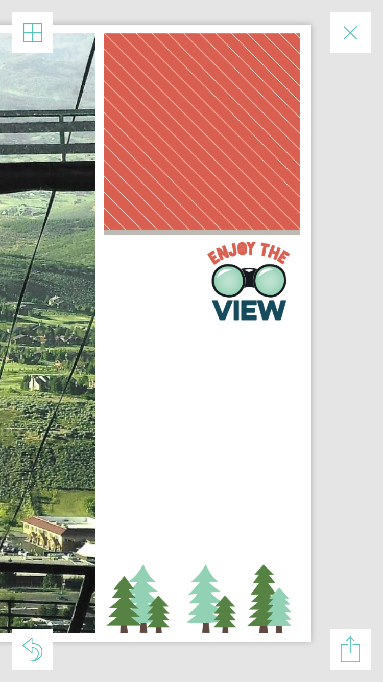
There's a perfect filler card that says "Enjoy the View" which totally fits the page, so I drop that into the top slot. Then I find a journaling card with some pine trees along the bottom, which again, totally fits my page, so I add that to the bottom card slot.

The reason these two cards look like they are just one big, long card is because I have turned off Drop Shadows in my Preferences. With Drop Shadows off, there is no "edge" to the cards because the card edges are actually white and my page background is also white. If I had Drop Shadows turned on, there would be a slight gray edge at the bottom/top of the cards and you could see where one stopped and the other started. But you have to either turn your Drop Shadows on or off BEFORE you start your page, and can't switch mid-page.

When it comes to journaling, I know there are a lot of opinions about how big or how small or how consistent from page to page you should set the font size. Here's my philosophy: I type what I have to say, in the font style I like, and then I enlarge (or reduce) the size until it all fits on the card. Period. I've never had the journaling be too small to read when the page is printed and I've journaled a mini-novel on a card before.

So I add my journaling (this is another thing you can set up in Preferences--the style of font, and size that the card starts off with--which you can totally change at will.) I don't have a whole lot to say, so it doesn't fill much space on the card:


I almost always choose to center align my journaling, so I make that change, and then I increase the font size until it fills the available space on the card.


So now that my journaling is added, the page is pretty much done, except for the decision of the background color.... 

Ok, here's your change to participate as the audience! :) Here's the page with a couple of different options. Vote for your favorite in the comments!

A: White background, with Drop Shadows turned off

B: Green background
C: White, with Drop Shadows turned on
That's it! Save and backup the page and I'm done!