Tuesday, November 3, 2020

I Wrote a Blog Post for Humble & Create and You Can Read It Too!

 The following is a re-post of a blog I wrote for Humble & Create (one of the designers I make pages for). So if you read it there, this is the same thing. But if you don't know what I'm talking about.... then read on! 

:)

I’m sure the burning question on everyone’s mind (note the sarcasm) is “I wonder how a guy would go about making a scrapbook page?” 

Well, here’s your chance to find out!

First let’s talk a little about how I organize things to get ready to make a page.  I have all my digital supplies saved on Dropbox. I organize things in folders first by designer, then by kit name, then by kit “piece” (you know, elements, journal cards, etc.).

So for the page I’m about to show you, I have a Dropbox folder for Humble & Create, and nested inside that folder is one called Turkey Day Kit, and inside that are folders for Turkey Day Elements, Turkey Day Journal Cards, Turkey Day Pattern Papers, and Turkey Day Solid Papers.  This method makes things easy for me to find when I go looking!

I start off the majority of my pages with picking out the photos. I tend to pick one or two central photos to focus the page around. Sometimes it’s a bunch of photos, though, depending on the subject matter.

I usually use the Project Life app to arrange my photos, because I can’t for the life of me get anything all lined up and evenly spaced! This helps do that part of it for me. So I pick a template in the Project Life app that has the orientation and sizes I want for my photo and drop it in.


Then, if I’m using a journal/pocket card, I’ll access it from its Dropbox location, and pull it into the template as well. See, I didn’t even have to worry about lining things up, I just used the Project Life app template!


If I want to make things easier, sometimes I will use the Project Life app’s Free Form Text journaling option and add my journaling to the card while I’m still in the app. Sometimes I do, sometimes I don’t. If I know I want to line things up with the pre-printed lines on a journal card, it can be easier to do it with Free Form text in the app than later with a text box when I’m adding my other digital elements.


Ok, this next part may seem a little silly, but will all make sense the further you read, I promise! Within the Project Life app you can change the background color (the color used in between all the pockets). I want to change that background color to some obnoxious color that isn’t in any of my photos or on any of the cards I’ve chosen for the page. So for this page I’m going to choose a bright teal color. (Hang with me, it’ll make sense in a minute!)


Then I’m ready to get out of Project Life and finish the page digitally! So I export my page from the app, save it as a 12 x 12 image, and save it to Dropbox. The Project Life app will recognize that there are “empty” pockets and ask if you still want to export it. Yes, we do! We’re gonna fill those in elsewhere!


So when I go to check out this exported page in Dropbox, here’s what I’ll see. 


The Project Life app automatically fills in all those empty pockets with that teal color (or whatever color of background you had selected in the app). I am going to be removing all that empty teal space in just a second, but the reason I chose an obnoxious color is because I knew my photos and cards didn’t have that color in them. If I had chosen a white background and also had white edges on my photos or cards, when we get to the next step which is removing the background color, it would have removed part of my photo, too! There’s a picture below to illustrate. So when in doubt, choose an obnoxious background color that doesn’t match anything on your photos or cards, and you should be able to remove it easily. That’s the next part!

For the rest of my page creation process, I use a free, online program called Photopea (https://www.photopea.com/). It’s like a generic version of Photoshop, and it has the same types of features and buttons and layer panels that Photoshop does, just located in different spots and called something slightly different than what Photoshop calls them.

Next, I download my incomplete page from Dropbox onto my computer desktop so I can easily drag and drop it into Photopea. Then in Photopea, I simply drag my page onto the main work area.


So the first thing I want to do is get rid of that teal! I right-click the Object Selection tool on the left margin toolbar in Photopea, and choose the Magic Wand tool.


With that tool selected, I click somewhere in the teal space of my page. Everything inside the dotted lines (meaning all the teal) will be deleted when I hit the delete key on my keyboard! 


Here’s what using a white background would have looked like:


So, after I hit that delete key on my keyboard, here’s what I’m left with:


In Photopea, a checkered background means that there is nothing there. It’s transparent. We’re going to be filling this up with digital papers and elements from Humble & Create!

For everything else, I’m mostly going to be focusing on using the Layers panel on the right side of Photopea. Think of making your page this way. Everything is a layer. Layers on top of layers. In the Layers panel, whatever is listed at the top, is also the top layer of your page. So right now, all I have is my Background layer (that’s the name Photopea gives it automatically). What I want to do is to add a digital paper underneath that layer.


To make adding digital items easier, I take the supplies I think I want to use on the page and download them from their storage folder on Dropbox, and save a copy of them on my computer. I have a folder on my computer desktop called Page Building, and I pull in all the bits and pieces I think I’ll use on the page. If I find later that I need something else from Dropbox, I’ll just quickly download it and save it in Page Building, and keep going from there.

Now, I’ll walk through the steps of adding some background papers, and then it’s really just the same steps over and over arranging things in layers as you add them to the page!

When I have the paper I want to put under my photos/cards, I drag it from my computer folder onto the Layers panel and drop it under that Background layer (because I want my paper to be underneath my photos). It’s hard to see in this image, but there’s a dark line under that Background layer. That dark line is where this new layer will go when I drop it!


It’ll take a few seconds for your new layer to load in Photopea, but then you’ll see it—right where you wanted it—under your photo!


After that it’s really up to you how many additional layers you want to add to your page. Add elements, add more journal or pocket cards. You can add drop shadows to your layers (more on how to do that in this post I wrote last year). 

Add as much or as little to your page as you want. It’s your page after all! You might end up with something like this when you’re finished!


The best part, is that using a kit from Humble & Create makes creating a page a snap! Throw in you photos, add a few papers and elements--all of which totally coordinate and color-match because easy Humble & Create themes each of their kits and picks a fun color palette for them, too!

That's my process in a nutshell! Nothing too fancy or advanced. That's how I roll! :)


Friday, July 31, 2020

Make It Work For You - An Approach to Editorial PL Templates

Hey there everyone! Don't fall off your chair, I'm back again with some little tidbits on knowledge.

I've been using the Project Life App 3.0 for a few weeks now, and have come around to the idea of using the Editorial Templates more and more.

Sometimes I feel the need to tell the story behind the photos on a page. Using a normal PL collage page is fine for 80% of the pages I create because  I like to "show" the photos.

But at other times, there's a story I want to tell. You know, the WHO, the WHAT, the WHERE, the WHEN, the HOW COME, and the WHY of the situation the those photos come from. That's when I'll tend to lean more towards the PL Editiorial templates.

As you may have seen in the app, there are a couple of different "sets" of Editorial templates you can purchase, along with a couple freebies, too. First let's talk freebies.  You have the "No Photo" template which just has text boxes for a title and two columns of text. Then you have the "Full Photo" template that is just a single photo--but remember, you can export a completed collage page and bring it into this template as a single photo, so there's that little trick. (You can get an idea of what I mean by exporting a completed page and bringing it back as a single photo in THIS post.)

Now let's talk about the editorial kits that you can pay for. Each set of templates has 4 styles included. The number indicates the number of photo pocket in the template (Template sets 1A and 1B have a pocket for one photo, 2A templates have 2 photo pockets, etc.)  What I'm here to tell you, is that you don't necessarily have to purchase those extra templates simply because you want to fit in more photos!  That's today's tid-bit of knowledge.

Let me show you what I mean.

I did actually purchase the Set 1A. It has four templates. I liked this set because it had two templates with large photo pockets, one vertical and one horizontal. 


And I knew that I could import pages/partial pages that I've made into those pockets.

Here's an example of a page I did that way. You may have seen this page on my @projectlifeappdude Instagram account.


I knew that I wanted to use the Set 1A (no. 2) Editorial template, but I wanted to use three photos in the pocket, not just one. And I didn't want to spend the additional $5 for the Set 3A Editioral templates that had three photo pockets.  There's always a workaround, if you know how, or take some time to experiment!

I put the three photos I wanted to feature on the page, and put them into a normal collage page using template Design W.


I exported the incomplete page and saved it to my camera roll, knowing that all the "empty' pockets would fill in with a white background. Hint: Whatever color you have chosen for your page background, that is the color any empty pockets will fill in with if you leave them blank and export your page.

Then I switched over to the Editorial page in the PL app, pulled up the template I wanted to use, and tapped the photo icon to add a photo.


I found my three-photo "page" on my camera roll and added it to my editorial page. It fit like a glove! Though you may have to pinch and zoom a little to get yours to fit depending on how you arranged your photos in your original page.  Play around with it. Experiment! Make mistakes! Learn from them! 

(Wow, I totally sound like Miss Frizzle from the Magic School Bus!)


Then I added my journaling and title, and was done! Saved a little money not having to purchase additional template sets with a little outside-the-box thinking!

Here's another example.  

I made this page:


It was the same kind of situation. I wanted to use 3 photos, but only had a 1-photo Editorial template. This time, I pulled my photos into collage template Design 6x8 B.


The only catch was, that this template was vertical, but the photo pocket on my Editorial page was horizontal.  No problem. Once I had pulled my photo into the pockets, I tapped on each one, and 1) tapped the EDIT icon, and then 2) manually rotated the photos so they were all sideways. Then I exported that page and saved it to my camera roll.


I opened my Editorial page template next, pulled in that sideways page, and repeated the steps above to  get them right-side up again!


Easy peasy!

I hope this has helped your realize that you don't have to necessarily spend money on additional templates to simply be able to feature multiple photos on an Editorial page.  Some might think spending the extra money so you DON'T have to go through all these extra steps might be worth it. To each their own! I find it a creative adventure!

Until next time....

Sunday, June 28, 2020

Project Life App Update 3.0 - An Honest Review

Hello there! It's been a hot minute since I've posted anything on this blog, but I thought I do an HONEST REVIEW of the new Project Life App update that came out yesterday.

Some things have changed, some things have stayed the same. Some things just have a new name. I'll get into all of those things here.

App Navigation


Remember how there used to be the 4-colored circle on the home page and you selected the quadrant based on what you wanted to do in the app?


That is gone and has been replaced with three options (which I'll go into greater detail explaining further below):
  • Create - Build/create your pages here
  • Library - View your kits, fonts, and finished/in-progress pages here
  • Order - purchase prints/books through the app here


The Create Section

This section is divided up into three kinds of pages you can create: Collage Page, Editorial Page, or Small Print.


Collage Page

First things first. New in this update is a Project Life app vocabulary change. In the previous version, the word "collage" meant going into that orange colored quadrant from the homepage, and working with templates that didn't have spaces between the pockets. Now "collage" is the word for your normal, regular pocket page--because it's made up of a collage of pockets. Get it?

You can still change/choose a template by clicking on the grid-square button in the upper left corner. And building the page is exact same as it's always been. The PL people are just calling this kind of page, a collage now. 


One new feature that may interest you in regards to building a page in this section, is that when you add journaling to a card (or with FFT) when you go to change the font size, the little + and - icons on the sides of the size slider (you know the ones I mean) used to increase/decrease your font size by .5. In this new update, tapping the + or - will increase/decrease font size by .1!  


I find this equal parts frustrating and helpful! LOL If you really want to just nudge a font size up or down a teeny bit--yay! If you are in more of a hurry, you will just have to use the slider bar, or spend an hour tapping that +! :)

Editorial Page

This is new to this update. Editorial pages, are meant to feature one of two things (or a combination of both): Journaling and Photos.

Free with this update is a two column journaling page in a 12 x 12 size. 


There is a text box for a title, and text boxes in columns for journaling text. You can tap into each of these pre-formatted text boxes and type just like you do in a journal card. The lines on the card are just there to demonstrate that you can journal there. Once you begin typing your own text, those lines disappear.  You have all of the journaling abilities you are used to--changing the font, the font size, the text color*, the line spacing, the vertical offset, and the justification. 

*In regards to font color, for these Editorial pages, you are limited to a (rather wide) option of colors that appear when you tap the font color icon. Since you aren't coordinating with a card kit, you simply get a range of colors to choose from.


You can also add FFT to these editorial journaling boxes. However, I found that if you add a FFT box without typing something in the pre-formatted journal box, the lines don't disappear. Weird. 

Also, the big 12 x 12 photo square (the one that used to be in the orange collage section of the old version) is now found within this Editorial Page section. Tap the grid-square icon in the top left corner once you're in the Editorial Page section, and you'll see these two included-in-the-update options: two-column journaling page with title, and large square photo page. 


 If you continue scrolling on the bottom, there are additional Editorial sets you can purchase. Each set contains four layouts with varying configurations of photo pockets and journaling spots, and are priced at $4.99. One thing to note with these editorial pages, though. I have heard that your only option for those photo pockets is to use a photo--not a PL card from a kit. I haven't tested this out personally, since I don't feel the need to purchase one of these additional editorial layouts yet. But, if you really wanted to use a card in that pocket, you could always import it as a photo I guess. There's always a workaround! ;)

Small Print

This is where those templates that used to be in the orange collage quadrant of the old version are now located. All the 4x6 template variations are here. 


Tap the grid-square icon in the top left corner and you'll be able to scroll through those options. Just keep in mind that these templates don't have any separation between pockets, so your photos/cards will be jammed right next to one another.

The Library Section

Back on the PL app homepage, the second section is the Library. Tap on that icon to see this sections three areas:

  • Pages - Finished pages (if you haven't deleted them from the app), in-process pages, and PL folders are here
  • Kits - kits you've purchased, kits you haven't purchased, and (for iOS only right now) kits you've marked as favorites are here
  • Fonts - fonts you've purchased from PL or have uploaded on your own are shown here

Pages

When you tap into this area, there are headings along the top of the screen for each of the following: 


  • In Progress - any page you've started but that has at least one empty pocket (this includes any Editoral-style page you may have partially completed)
  • Collages - your finished pages (or pages that have all pockets filled, whether you're "finished" with them or not!)
  • Editorials - pages using the new Editorial feature that have journaling in all the journal boxes and a photo where applicable. If any of these elements is "blank" it will show up in the In Progress area.
  • Small Prints - your finished pages (all pockets filled) using the 4x6 templates. Any empty pockets and they're considered In Progress.
  • Folders - if you've created and saved pages into folders, they'll be found in this area. If you have a folder set up and tap to open it, you'll see a Sort option along the top. Tap that and you have the options to sort the folder's contents by
    • Modified Date
    • Creation Date
    • Event Date
    • Page Name
    • Folder Order

Kits

When you tap into this area, there are four headings along the top of the screen for each of the following:


  • New - kits from the latest kit update are shown here. FYI there were no new kits released in conjunction with app version 3.0, so there are the last kits from the release a month or so ago.
  • Favorites - this is a feature available for iOS only at this point. When you are looking at the list of kits you own, you can tap and hold a kit and then add it to your Favorites. Kits that you've favorited show in this area.
  • My Kits - pretty self explanatory, it's the kits you've purchased, shown in alphabetical order
  • More Kits - kits that you haven't purchased (yet), shown in alphabetical order
A NEW feature in update 3.0 is the search bar within kits! You can type in a keyword for what you are looking for, and matching results show up. You can search by kit name, color, card wording, and for the most part, you'll get a list of matching results. 

Searching for "overlay"

Looking for kits with solid "blue" cards

Looking for results based on my search term "love"


My opinion - It's a decent tool. There are some glitches and things that are kind of wonky with it. I can appreciate the manpower it took to look through and load search terms and results into a feature like this. I really can. I just wanted it to work BETTER, since it's a feature people have been asking for, for a long time. Here's some of my test results:
  1. I tried searching for each of the colors found in typical 8-count Crayola box (red, blue, green, yellow, orange, purple, brown, black) and got varying levels of success. My "orange" search had lots of kits shown with orange cards--but also had a lot of very obvious brown shades shown, too. So I searched for "brown' and didn't get any solid color card results (though there were a few kits that showed up). A search for "yellow" showed a bunch of olive and army-green shades that didn't show up when I simply searched for "green". A "red" search had a lot of orange and pink cards as well. 
  2. When you do a search, it first tries to match up Kit names and will show those in the first results (if any). Then it will look for exact matches to your search term and show those next, and then it will show variations on your search term.  For instance, I searched for "Heart" and it found: Oh My Heart All-in-One kit, several cards in kits that had heart wording on them (queen of hearts, sweetheart, you make my heart sing, etc, and then heart shaped cards individually. Each result will have number behind it in parenthesis, indicating how many card kits contain what you've searched for. When you tap that, you'll be taken back to the main Card Kits page and the My Kits and More Kits sections will have a number showing the matching card kit results for your search term, plus the thumbnail of the kit.
  3. There are some things that don't show up that I know there are matches for, card-wise. For instance, I searched for "horse" and "barn". I know there are matching cards in the Front Porch Value Kit, that contain these elements, but they didn't show in the results. 

Fonts

When you tap into this area, each of the fonts you have purchased in (or that came pre-loaded in) the PL app are shown with an example sentence typed out which shows how each alphabet letter will look. 


This is similar to most font sites. As you scroll down the list, you will also see any fonts you have uploaded to the app. This is an add-on feature, if you aren't familiar with it. To upload you own fonts, once you've purchased this feature, tap the + sign in the upper right corner when you're looking at your fonts.

The Order Section

Back on the PL app homepage, tap the Order icon and you will see the information you need to order page prints or photo books directly from the app, using BH's preferred provider White House Custom Color. You can see past orders as well as links to tips and FAQs about ordering on this page. This page is basically the same as in the old version.

So that's it in a nutshell! If you'd like to "watch" we work through the new app, I did a video on my YouTube Channel last night as I was playing around. You can watch it HERE.

I'm pretty excited to begin using some of the new features. It's fun to see the scrapbooking world evolve! 

Tuesday, January 7, 2020

A New Approach to Daily, Weekly, or Monthly Pages (No PL App Kit Needed!)

I know, I know. It's literally been half a year since I've added a blog post. Life just gets busy some times, you know? In the mean time, I did make a few Youtube videos for my See Sean Scrapbook channel, but even then, those have been few and far between lately.

But I'm back today because I was inspired by some new digital scrapbook products I came across as part of my work on The Digital Press creative team.  Laura Passage has released some great pocket card kits that can help to fill the void left by the Project Life App not having a Project 52 (they used to go a card kit for weekly scrapbook pages--hence the 52 for 52 weeks in the year) or Project 12 (same concept, but monthly) kit this year.

I know there are hundreds, maybe even thousands of scrapbookers out there who would love a new kit to help them create their pages, no matter if they do them weekly, or monthly, or just sporadically.

But I digress.  Laura Passage, a designer (and owner) of The Digital Press has created these card kits that you can use (and customize) for daily, weekly, and monthly scrapbooking.   I thought I'd walk through some ways you could use them, and then let you loose in the store to purchase them! You won't be sorry, I promise!

Each of the card kits has two versions of  each card. One in 3x4 size and one in 4x6 size - and they come in horizontal and vertical styles! The 3x4 cards are vertical and the 4x6 are horizontal.

There is a Daily kit, where each card has a day of the week abbreviated in large block text, and then the whole weekday is also printed in script.


The Weekly kit is similar. The week numbers (1-53....because it's a leap year!) are in the block text and the word "week" is written in script.


And finally, the Monthly kit. This is the one I am personally going to use this year. The month name is abbreviated in block text, and the the month name is written in script.


There's a couple of ways you can use these cards.  First, after you purchase and download the kits, you'll have to save the cards to your computer somewhere--or online in Dropbox or Google Drive--somewhere you can access them from, and then pull them into your Project Life app as photos.

I have made a Youtube video about how to pull in cards from Google Drive that you can watch HERE.

You are going to be limited to just pulling in the cards as they are by default: gray colored block letters for the days/week numbers/months on a white background, with the script showing in black.

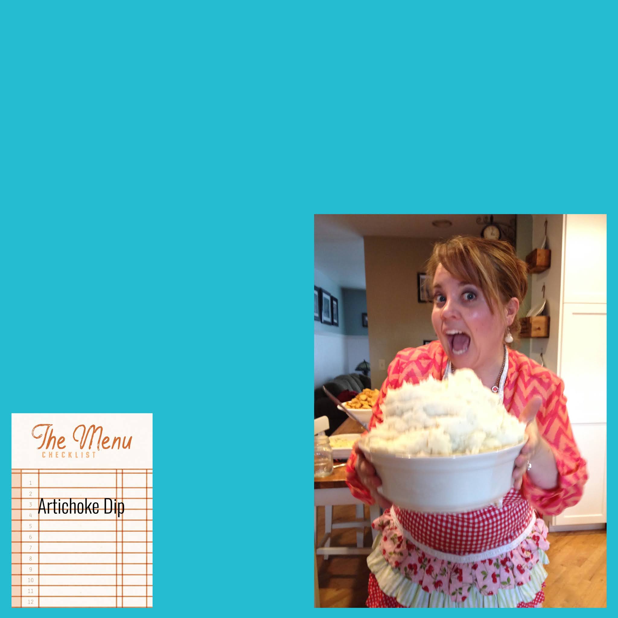
In this example, I pulled in the Jan-Apr cards into the middle pockets of the PL Design A template, changed the background to black, and left all the other pockets blank (so they filled in with the background color):


Pulling the cards in and placing them in your desired pockets the same way you do with photos how you can use these kits if you just want to stick with the Project Life app, and not get into anytthing more "digital". Which is a perfectly fine way to do things. Just know that you are limited to these black/white/gray cards the way they look here.

But also included with these kits you can purchase are the PSD files.  PSD files are for use with Photoshop - or a free online alternative, Photopea.com (Search for Photopea within this blog for more posts about how I use this great tool to do some fancy things, without having to shell out the big bucks for Photoshop!)

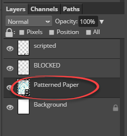
With these PSD files, each card is made up of different layers: a background color, the block letters, and the script letters.

I'm going to talk in terms of using Photopea.com to work with these PSD files, since that it what I've learned how to use on my own. Photoshop is very similar, and if you already know how to use Photoshop, then you probably don't need to continue reading unless you want to! ;)

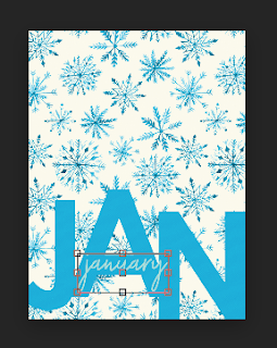
Okay, as I was saying, the PSD files are made up of different layers, and you can manipulate those layers to create a different look to these cards. You can add a digital patterned paper as either the background of the card (what appears as white on the original card), the block text (what appears as gray on the original card) or the black (the script writing on the card):

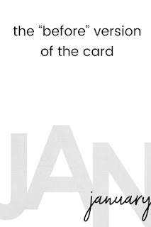
This is the original version of the card.


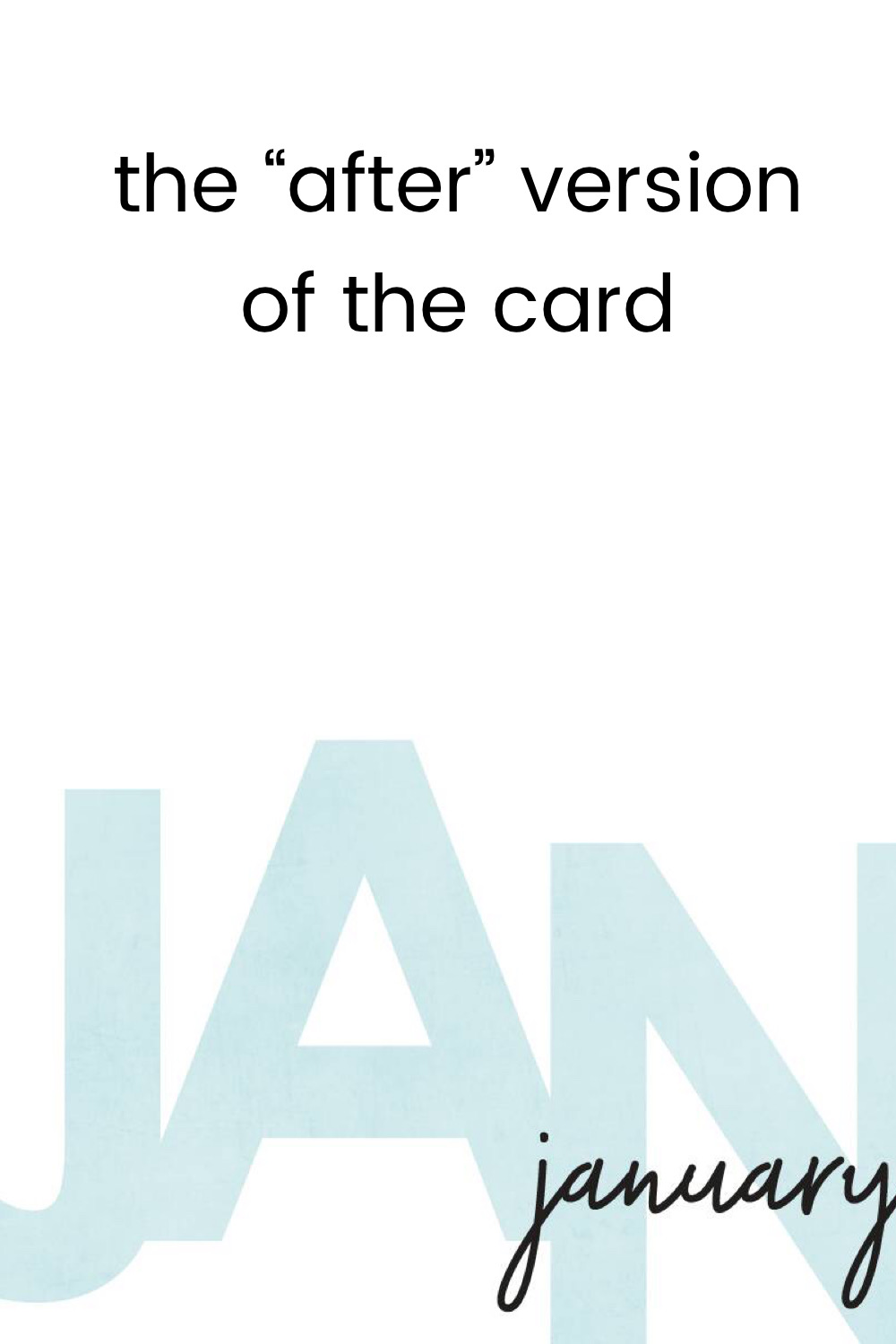
This version had the gray block letter layers replaced with a blue digital paper layer instead.

This version added a digital patterned paper as the formerly white background layer, a darker solid digital paper as the gray block letter layer, and a lighter solid digital paper as the black script layer. And since each layer is independent of the others, you can move the layers around, which I did here to move the script from the right side of the card to the middle.

So, do you think you are ready to tackle the steps on how to do this? Believe me, if I can figure it out, anyone can!

When I downloaded the card kit from The Digital Press, I saved all the contents into my Google Drive. They were already organized into folders, so I just renamed those folders to be more meaningful to my organizational system. So I have all the PSD files saved together, and each one is named after the month and size (3x4 or 4x6) that each card is. I found the card I want to work with in my Google Drive files, and I downloaded it to the desktop of my computer.  I also downloaded (from Google Drive) the different digital patterned papers I wanted to use.  I found it easiest to put all the "pieces" that I will be combining into my finished product into a single folder, so I can easily access them as I create.


Okay, let's show you how I do it! First, I go online to Photopea.com and I click the big Open from Computer link on the screen.


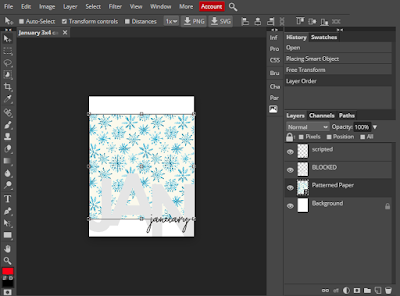
This brings up a window where I can choose the PSD file to work from. I go to the folder that contains all my "pieces" and click on the January 3x4 card PSD file. That file then opens up in Photopea.


If you look at the Layers panel on the right, you can see the different layers that make up this card: the Background layer, the Blocked letters layer, and the Scripted letters layer.


For this example, I'm going to manipulate all three layers. But maybe you'll only want to play around with a single layer. That's fine (whatever floats your boat), just know that a lot of the same steps apply no matter which layer you work with, so be sure to at least read this first section, and then you should be able to just repeat these steps for the other layers you want to manipulate.

The Background Layer

I want to make the background layer of this card be the patterned snowflake digital paper. I have that saved in my "pieces" folder, so I am going to open that folder and click and drag that patterned paper on my Jan card. Just drag it right onto the top of it.


When that pattern paper uploads to Photopea, it will be added to my Layers panel.


Here's a pro-tip:  When you click and drag your digital papers to Photopea, you can specifically drop them where you want them in the Layer's panel. For this project I want everything I add to my Layers panel to appear right above the layer I'm working on. So I want this patterned paper above my Background layer.

If you forget and your patterned paper ends up somewhere else in your list of layers, you can easily click on it to select that layer, and then drag it down (or up) to the location you want.

You should be able to see your patterned paper on your screen. It will probably be a bit smaller than the January card itself, and that's okay. We're going to enlarge it next.


In the Layers panel, make sure that the Patterned Paper layer is selected (it will be darker than the other layers). Then, on the left side of your page, we are going to select the Move Tool (the top arrow button). Once you click that button, along the top of the screen, make sure to check the Transform Controls box.


Once you check that box, the layer you have selected (in this case, the Patterned Paper layer) will be outlined by a box on your screen.

See how the patterned paper has a thin box around it. 
We are going to use the squares on the edges of the box to enlarge our patterned paper so that it is the same size as the Background layer of the card.

Use your mouse to click on one of the corners of your patterned paper, right on the little square. Hold down your Shift key on your keyboard and at the same time, use your mouse to drag the square outwards, so it becomes the same size as your January card.  This should enlarge the patterned paper proportionally. The area you enlarged will be partially out in the middle of the black area of the page. That's okay. That's what we want.


Note: You have to use the Shift + mouse drag method, or else you will be stretching the patterned card and your snowflake pattern won't enlarge proportionally--it'll end up all squished and weird looking. If you find that happening, let go of your mouse and click the Edit button at the top of the screen, and then click Undo. That will undo the last thing you did (which was the weird stretching thing).

When you have enlarged the patterned paper so it is at least as large as your Background layer, you can let go of your mouse, and then click in the middle of that square you enlarged. Drag the patterned paper so that it covers your Background layer completely. If you didn't quite enlarge the patterned paper enough, you can repeat the Shift + mouse drag step again.


Once your pattern paper is as big (or bigger) than the Background layer, go back to the Layers panel, right-click the Patterned Paper layer and select Clipping Mask.


A couple of things will happen. First, within your Layers panel, the Patterned Paper layer will now have an arrow in front of it pointing to the Background layer below it.


And the other thing you'll see, is that when you click on the Background layer in the Layer's panel, on your Jan card, the patterned paper has taken the shape or that formerly white background layer!


The Blocked Layer

Now onto the Blocked letters layer. We are going to bring in a dark solid colored digital paper for this layer. Open your "pieces" folder and click and drag the paper you want to use and hover your mouse on the line between the Scripted layer and Blocked Layer. Essentially we are telling Photopea where in the panel we want this layer to go. You should see a dark line appear showing you where this layer will go.


Once the layer loads in Photopea, enlarge that solid color paper so that it will at least cover the Blocked letters layer. It should be the same size as the width of your card already, but look above for the steps to enlarge if needed. Then, click in the middle of the solid color paper and move it on the card so that it is completely covering those block letters.


Then select the Dark Paper layer in the Layers panel, right-click and select Clipping Mask. Your solid paper now takes on the shape of the block letters! 


The Scripted Layer

Repeat thee steps above, dragging in the lighter colored digital paper and dropping it above the Scripted layer in the Layers panel.

Move the paper around so that it covers up the scripted letters, and then right-click and select Clipping Mask.

If you want to change the location of a layer (like maybe move the block letters to the middle of the card instead of at the bottom). You can click on the layer you want to move--not on the paper layers but on the original layers themselves--and then click the Move tool (left side of screen, top button) The layer will appear with a box around it. Click in the middle of the box, and you can drag it around anywhere within the confines of the background.


You can see here, that I've selected the Scripted layer, and moved it to the middle of the card.
Pro-tip:  If for some reason you can't see a layer, keep in mind that whatever layer is listed at the bottom of the Layers panel, will correspond with the bottom layer of your project. As you go up the Layers panel, those items are layered "on top" of your project. Make sense?

Then once you've finished your creation, from Photopea's File menu, select Export As and select JPG.  Then click Save. Because Photopea is an internet program. Your file will save as a download. On my computer it saves along the bottom edge of my internet browser window and I can then drag that file to the folder where I want to save it. You can also find this saved file in the main Downloads folder on your computer.

That's it! Can you see how creative you can get with this! I'm excited to create cards and use them in my PL app pages this year!