So my wife has recently gotten the "quilting bug", having started to attend our local church quilting group once a week, and taking a class at the local fabric store as well. She's made some really great pieced quilts with a Valentine theme, and most recently a Halloween themed one.
So seeing her at work in her sewing room cutting and piecing together different patterned fabrics, I thought to myself, "Hmmm. I wonder what I could do with the Project Life app?" Well let me tell you...PLENTY!
This is based on things I've seen Wendy Cardno, Meagan Johnson, and Jessica Mitchell do on their pages that look like patterned quilt squares, and combined it with what and Pam Dowell did recently with making her own striped cards on pages they shared in the
Simple Project Life Facebook group, and I just kicked it up a notch.
Here's how I went about the discovery of getting a quilted look on a PL page!
First, I picked a card kit that had lots of different filler cards with patterns. For this example, I used the
Doodle Edition.
I started in the Collage Section of the app, and pulled up the 6 x 8 C Template.
I chose this template because the individual pockets have more options for the ready-made cards within the Doodle kit designed for that size of pocket.
Then I pulled in four color coordinated filler card designs. All the card designs are made to color coordinate within a set, but some just go better together than others, you know? :) I actually did this process two times, so I had two separate pages of four-card patterns equaling a total of eight different (yet coordinated) patterns.
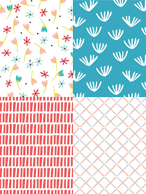 |
| Four-part Pattern 1 |
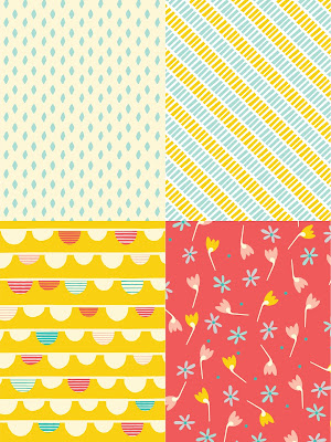 |
| Four-part Pattern 2 |
Then I exported and saved these pages each as an image onto my phone's camera roll.
Then I brought each one of these images from my camera roll (as photos) back into the PL app via the Collage Section in the 12 x 12 template.
The design actually auto-centered in the 12 x 12 collage making four equal squares of patterns.
Then I exported
this page as a 12 x 12 image to my phone camera roll, and repeated that process for the second four-part pattern.
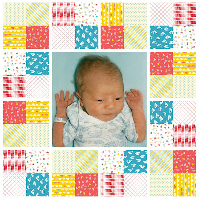
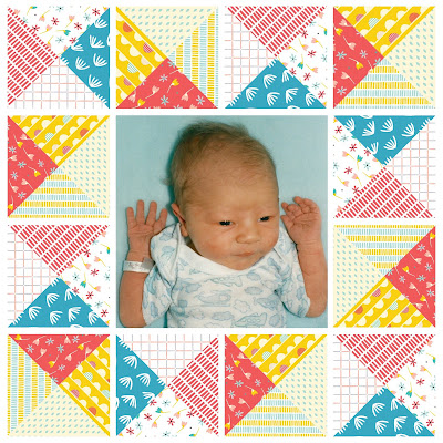
The idea here, is that I would use these four-part pattern squares within my PL page templates in square slots to create a "quilt" look.
For this example, I opened up the PL app to the Page section and picked the Squared Away 16 template that had square all around a bigger square in the middle.
Then, pulled those new four-part pattern designs into the first two slots along the top row of the page as photos.
Then I alternated between the two four-part patterns and brought them into the other squares of the template, but with each new set of two, I would used the rotate option native to the PL app, and rotate each new set I added one tap's rotation (90 degrees).
So for the first two cards I just brought in. Done. The next two patterns get rotated 90 degrees, the next two 180 degrees, the next two 270 degrees. Then, there were still a set left that I just rotated individually 90 degrees and 180 degrees to make sure they weren't the same orientation as the first cards. Make sense?
So pretty far, this hasn't been too mind blowing, and maybe some of you readers had already figured this out. So this next bit it is where it gets a little into the "why didn't I think of that" territory!
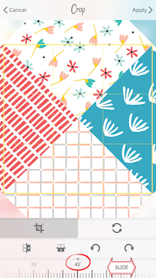
For those of you with Apple devices, you know that PicTapGo is awesome for lots of filtering reasons, but there are also some very cool cropping and rotation/flipping tools in it to. Android users, I hear its coming for you within the PL app, but you can purchase the stand alone PicTapGo app in the meantime if you want to "play". :)
Tap on one of the four-part patterns in your template. Then go into the editing options and tap PicTapGo.
Tap the crop icon to the left of the
PicTapGo logo on the top of your device.
Then tap the
Rotate tab at the bottom right.
Use the slider along the bottom to rotate the image to 45 degrees (or the other direction to 315 degrees) to get a four triangle-pattern.
 |
| The pattern will enlarge a little bit, but that's okay. |
Then tap Apply and Done.
The rotated image is now saved to your page, giving a completely different look to the page!
You can then go back to each set of four-part cards and manually rotate them 90, 180, or 270 degrees using the in-app rotation tool.
Once you finally add your photo to the middle, and maybe some FFT stitching (which I didn't show here) I think it gives the whole page a quilted pattern that looks awesome!
 |
| Four-part Pattern |
 |
| Four-part Pattern, rotated |
Like I said at the start of this blog post, there have been a lot of pages I've seen with a single square block with a single pattern in it from other PL app scrappers, but this new effect, creating your own multi-pattern pieces, builds on that (with just a few extra exporting steps) you can really make your pages shine with FOUR DIFFERENT PATTERNS!
Please try it out, and wherever you post your pages, tag me! On Instagram tag @projectlifeappdude or in the Simply Project Life FB group, just add my name!
I'm inspired by the ideas and pages that others post, and sometimes that sparks some extra creativity in me that I'll be sure to pass along as well!
Happy Scrapping!


