Happy New Year Everyone!
You guys will never guess what I did! But if you know me, it's most likely something that takes the Project Life App to a whole different level--but it isn't anything that is very hard. Even
YOU can do it!
For the longest time, I've wanted a specific kind of card kit to be included in the app. I wanted a kit that could be used to document those photos I have from vacations and/or travel that I've done within the United States.
Sure, there's the Road Trip Themed Cards and the Travel Themed Cards, but those are both kind of
GENERIC and boring. I want a card set that I could use to document a road trip through Utah, Colorado, Kansas and Missouri!
So..... I decided to make my own---and it really wasn't that hard, just took some time.
First things first. A little disclaimer, that what I'm about to show you requires the in-app purchases of both Free Form Text (FFT) and the ability to upload your own fonts to the PL app.
If you're still with me, here we go!
To begin with, I needed a font that contained the shapes of the different states. I did a quick Google search and found one on a site called
Font Squirrel. It's a font called StateFace. It's a dingbat font where each letter you type corresponds to a state shape.
A = Alaska,
a = North Carolina,
B = Alabama,
b = North Dakota, etc.
I downloaded that font and saved it to my Project Life app. If you haven't ever uploaded your own fonts to the PL app, here's a helpful group of steps written by Jenna from the
Simply Project Life Facebook group:
Once I had that states font, I was ready to create!
I wanted the cards I created to be some sort of red, white, and blue combinations (because hello, USA!), so I started off in the Collage section of the app...
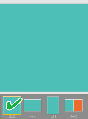
...and selected the 4x6 A template.
Using this template allows you to pull in Project Life cards into the space. Other templates in the collage section only allow you to pull in photos. Then I pulled in a plain red card from the PL app's Americana Themed Cards, to use as my backdrop.
My vision for these cards is to have a large state shape that I can either journal on, or add FFT to (like a star or a dot to indicate different cities), to help tell the story of the scrapbook page I will create.
First I added a FFT box to the card by tapping the plus sign (+) button.
Then, I selected the StateFace font I uploaded in my list of fonts, and typed the corresponding letter for the state I wanted to appear (in this case, A for Alaska!)
I knew that I wanted the state to appear as big as possible on the card, so I tapped and dragged the "dot" button on the lower right corner of my FFT box, and enlarged the box so the state filled the card. Then I added another FFT box (tapping the same plus sign button as when I originally added my first FFT box) that I could use to write the name of the state with.
There are a lot of different things you can do at this point with that second text box. One option is to change the font color to something other than white, so your writing stands out against the white of the state shape. Since I am using a red card from the Americana kit, I have those text color options available to me, so I chose the dark blue.
Now, you have even more things to decide! How big do you want that text? Big enough to cover the state shape?
I guess if the goal is to create a title card for use on your page, this is definitely one way to go. Another idea could be to only enlarge the text a little bit, and maneuver it to a location on the card where it doesn't cover up any part of the state. That way you can add cities you traveled to, or cities that have to do with the pictures on your page. And of course the fonts you use to do that are completely up to you!
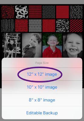
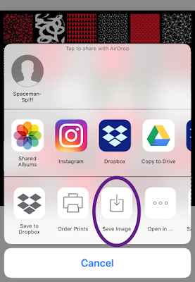
Then it's just a matter of exporting and saving the cards to your camera roll, and then plugging them into your pages! Here's a couple of examples of how I've used these cards on my pages:
Once you get the hang of how to create you own cards, you can either make up cards as you need them, or, if you are like me, spent a couple of hours every day for a week and make yourself a whole set!
Yep, I made a USA kit of my own. It has 257 different cards (one for each state, including the District of Columbia) in a 4x6 horizontal, 4x6 vertical, 6x8 vertical, and 6x8 horizontal size with the state as big as it would go on the card, with the name of the state written out--all in varying assortments of red, white, and blue!
Then I made another set of each state in a 12x12 square size, with the state shape and the state abbreviation overlayed on top of the shape.
Now I'm set for any and all vacation/road trip scrapbook pages I'll make in the future. And if for some reason the red, white, and blue doesn't go with the color scheme on my page, I know I can easily swap them out for matching colors if needed!
Hope this has inspired you to try creating some filler cards of your own when you find that the Project Life cards just don't have what you need!
