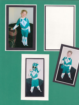
Let's start off with the BEFORE:
Nothing fancy, just some matted photos and some room left for eventual journaling (we all know how that turned out!)
So the first thing I noticed was that there are three vertical photos. There wasn't any photo that I'd necessarily want on an app page that was bigger than the others, so that limited me to looking for a template that would have three same-sized vertical pockets.
Since there was three photos, I wanted to space them across the page, and I knew that I wanted the other three spaces for journaling. Template Design L fit the bill!
I knew that I wanted a dark green background for those journaling cards. So in a break from tradition, for this page I actually put in the blank green journaling cards (from the Soccer Edition set) first, and then added the photos.
I knew that I wanted a dark green background for those journaling cards. So in a break from tradition, for this page I actually put in the blank green journaling cards (from the Soccer Edition set) first, and then added the photos.
The reason I chose the three blank green journaling cards was because I spent (probably too much) time going through all the card sets I owned looking for a card that I liked that had some kind of dark green element on it--a frame, some kind of design, etc. And I didn't like ANYTHING. So then I thought about just using a plain green card and then adding an overlay.
I found some white diagonal lines in the Just Add Color Photo Overlays set. So I added the overlay on top of the green card, and then typed my journaling. I had to left justify the text, and manually put in some hard returns to fill the space without overlapping the overlay.
I found some white diagonal lines in the Just Add Color Photo Overlays set. So I added the overlay on top of the green card, and then typed my journaling. I had to left justify the text, and manually put in some hard returns to fill the space without overlapping the overlay.
I really liked how the diagonal lines were on the left side of the bottom picture, and wanted to mirror that on the other side. For this I had to save what I had so far on the page, and then recreate the green card using the Collage feature of the PL app. I don't know if you all have played around with this feature, so I'm just going to talk you through my process as if you haven't. :)
On the PL app homescreen, I tapped the orange section, and that brought up my default collage template. I knew that the slot on my page was a vertical 4x6 slot, so I tapped the grid button on the top left of the app to bring up the collage templates. I picked the 4x6 B template.
Then I put in the same blank green journaling card, and added the same diagonal line overlay on top of it. Then I exported that whole card as an image to my camera roll.
Next, I pulled up my page in progress again, and in the bottom right card slot I pulled in the collage I just created as an image. Once it was in the slot, I tapped the button on the top left (the button with the three slider bars--does this have an official name?) and that brought up the options for changing the brightness, saturation, etc--but most importantly, the option to rotate.
I rotated it two tap's worth (180 degrees) so that the diagonal lines were now on the left, closest to my photo.
A little snag at this point in the process. Since I brought in that card as a photo, I couldn't journal on it in the PL app. So I ventured out of the app entirely and opened up the photo from my camera roll in the LetterGlow app. I knew that the card would eventually be set on my finished page with the diagonal lines on the left, so if I were to add my journaling text, I'd have to do it upside down here in LetterGlow and then pull the card in as a photo again and rotate it. Whew, talk about outside the box thinking!
So I added my text (they have the Amatic font which I use in my PL pages, so that was a score for consistency!), and I turned it upside down using the tools in LetterGlow. Then I saved this new card to my camera roll, and went back into the PL app and pulled it in as a photo again.


No comments:
Post a Comment
Don't just be a lurker! Leave a comment!