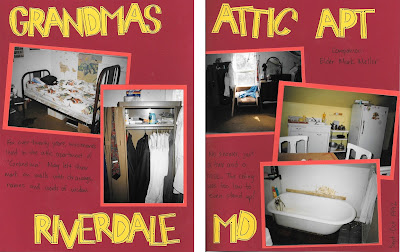
For my next project, I thought I'd tackle a two-pager from my old mission scrapbook. This one was a little more "fancy" that the last one, with some of that letter-stencil-cut-out action I mentioned earlier. And I also did a fair amount of journaling on the page, too. But still not a fan of my handwriting and inability to write in a straight line!
This one is a little more challenging because 1) I layered the photos on the page, and 2) I glued some of them down at an angle. Since I was trying to just pull things straight into the PL app, this could be tricky.
As I mentioned in my last post, the first thing I did was to scan the two pages and save the files in Dropbox, then I downloaded them to my phone's camera roll. While the PL app (at least for iPhones) does have the ability to pull directly from Dropbox, I have found that the lag time is considerable (especially when I'm at home on wifi that's slower than a three-legged turtle) than if I just pull them from my photos.
So, I first look at the orientation of the individual photos I want to use on the page. And these pages look like there's one vertical and three horizontal--so Design A template it is!
Since I'm working with the whole page as my image, I pull that into my 4x6 card slots and then pinch and zoom and drag the photos so they are filling the space on the card. For those photos that were glued down at an angle (like the bed photo) I zoomed in close enough so that my orange matte didn't show.
I knew that I had quite a bit of journaling to add to this page, some of which I had written on the old pages and some that I knew I wanted to add. So even though that window picture could have worked in the last big slot, I opted to fit it into a smaller slot to leave more room for journaling.
I wanted to use the same LDS Missonary Elder Edition cards, but not neccesarily something in plain black and white, so I opted for navy blue instead. I had two small 3x4 slots, and a bigger 4x6 slot to fill, so looked for a pattern that was available in both sizes.
Then it was just down to adding the journaling. Here's my (not so) secret when it comes to journaling. I use my phone's Voice-to-Text feature. It saves me time and from having to type out things with my fat little fingers (doesn't help that I'm a total index-finger-only texter). I just tap on that little microphone looking button, talk into the phone, and it's done. Just be sure to double-check what it writes down, as there are sometimes errors, but no more so than when you get auto-correct errors when you type.
First, tap the grid button on the upper left corner of the app, like you were going to change the template.
That brings up a screen from which you can do several things.
A. The "Color Palette Picker" button: Tap this to open the Pick a Color Palette page. This shows all the kits you have purchased, and beneath the thumbnail of the kit are several colored dots which indicate the color options you can use to change your background.
Tap the kit that matches the card(s) you used on the page. You'll be taken back to your page, and you'll have options of colors to choose from at the top of the page for your background (plus a selection of white, black, grays, and browns).
B. The "Square/Round Corners button: Tap this to turn on/off the square or rounded corners option. It's a simple toggle. You're switching from rounded to square with each tap (and you can visually see what each looks like on your page when you tap it).
So there you have it. Another analog to digital scrapbook page, this time taking a two-page spread and converting it into a single Project Life app page. A quick export to save the JPG file and to save the Editable Backup. And I'm done.


No comments:
Post a Comment
Don't just be a lurker! Leave a comment!