Thursday, July 5, 2018

Making the Most Out of Blank Space

If you are like me, when the time comes to choose a template for your PL scrapbook page, you'll most often skip by the Design G - Design J templates because "Why would I want all that blank space around my photos?"


But with a little outside-the-box thinking, these templates are GREAT to use! Here's how you can make the most out of all that blank space! (Shout out to a Simply Project Life Facebook group user, Annaliese Katharina for first demonstrating this idea on one of her pages).

First, put your photos and journaling cards into the template as you normally would, and then adjust the background color to your liking.


Then save the page and export it as a 12x12 image.


Then open up the orange Collage section of the app.


Select the 12x12 template option, and bring in your page as a photo.


Once you have your page brought it, you can use Free Form Text in the "blank spaces" and add your text there!


Rotate and position your text where you want it, choose your font color and size, and there you have it! A template you will actually USE now, with just a couple extra steps!


Wednesday, June 27, 2018

Outside-the-Box Pages!

Hello there everyone! I'm back with another quick step-by-step to demonstrate another new trend in Project Life App scrapbooking - titles that span individual pockets! 

I first saw this technique used on a page that Jessica Andolsen posted on the App Scrappers-Simply Project Life Facebook group (hi Jessica!).

I played around a little bit and came up with my own page:

And here's how I created it:
*Disclaimer the thin grey bars in the following pictures at the top and bottom of the page, are just how I cropped the screenshots on my phone, and aren't part of the finished page.

I started off by choosing the Big Shot 3 template in the app, because I knew I wanted a single photo to be the focus of the page.

Big Shot 3 template. I'm pretty sure this is in a template pack that is an additional purchase within the app. But if you like big photos on your pages, this is worth the couple of bucks to purchase the pack!
Then, I pulled in an adorable (if i do say so myself) picture of some of my newly hatched ducklings into that largest pocket.


Then I filled in the pockets on the left side of the page with a solid color card. In my case, I used plain white cards from the Neutral Cards kit.

Solid white cards on the left. You could use any solid color, but you'll want to match it with your background color, and turn drop-shadow off if you want that "seemless" look.
Then I looked through a few different card kits until I found a journaling card that 1) was square (to go above my duck picture in that pocket), and 2) had a white background so it would blend in with the solid color cards I used in the step above. Then I put those cards (these are from the Project 12 June kit) into the two square pockets above the duck pic.


Next, I added my journaling onto the bottom left card, and positioned it towards the bottom of the card to get the overall look I was going for, and to leave room above it in the open white space for my title.


Okay. At this point I knew I wanted my title to be BIG and to not be confined to the pre-determined size of the cards slots on the left. So I saved the page as it was to my phone's camera roll. There's nothing special about the saving process. It's the same as if you are saving a completely finished page. Click the export button and then choose Export... 

Then select 12 x 12 image (so you get a high-quality version of the page)...


And then save the image to your phone.


So here's the steps that some of you may not have ever tried out before. It's a little "outside the box" thinking, which is totally appropriate because I want my page's title to expand OUTSIDE THE BOX!

Got to the Collage section of the Project Life app by clicking the orange section on the home screen.

Then select the collage template that is the single 12 x 12 square. Then, pull your exported page into the square as a photo from your camera roll.


The whole page comes in as a photo in a single piece through this process. There are no longer individual card slots. It's one "photo", which means you can use Free Form Text to write on it!


I wanted to use two different fonts and sizes for the title of the page, so I added a Free Form text box to the page, typed my title, changed my font/size/color and dragged (drug?) it to the spot on the page where I wanted it. In this case I wanted this first part of my title to only be in the white area of the page. (If you've never used Free Form Text before, or need a refresher, click and read THIS POST).


Now for a little creativity! For the bigger part of the title, I wanted a layered effect. Use another Free Form Text box and type your title out. Enlarge the font size and note what font size you use (because you'll want to duplicate this same size to get the layers to line up nicely).  Then, create a second title using the same font/size but choose a different coordinating color.


Decide which color title you want on the bottom, and tap and drag that title into place. I especially love this technique, because your titles no longer have to stay within the confines of a single card slot! They can even overlap onto your photos if you want them to! Once that bottom layer is in place, tap and drag the other colored title over the top, with just a slight overlap so you can still see the bottom layer.


And there you have it! A page that looks like a fancy, schmancy graphic designer created it, instead of (in my case) a fat, old guy in his pajamas laying on the couch! :)


Friday, June 8, 2018

Latest Trend: Photo-strip Pages

One of the latest trends that is flying around Project Life groups online is creating pages that look like they incorporate a strip of photos like you'd get at a photo-booth. These pages have a fun look, and it's quite easy to create in the Project Life app, though there are quite a few steps. I'll try to document the steps visually here to give you and idea of how to do it on your own.

There is a disclaimer here at the start so you don't get all the way to the end and can't finish. This process does use some rotation capabilities through Pic Tap Go, which is integrated into the Project Life app, but not available for Android users. So if you are Android....you can still make these kinds of pages, just might not be able to do the rotation part of it.

Let's jump in!

First, you'll want to have a group of at least four photos that you want to incorporate into the "strip". These can be selfies, action shots taken in sequence (that's what I'm going to us), random pictures from a trip, anything really. You'll just need four of them.

Select a page template that has square card slots. It's best if you can use a template with has at least three rows of four square slots. Either the Squared Away 5 or Squared Away 6 templates works great.

Either Squared Away 5 or 6 would work for this first step!

Place your photos in the second row of squares, making sure to leave empty squares all the way around.


Then, place filler cards in all the squares that touch your photos. You can use alternating cards (like I did), or a single card repeated. It all depends on the look you are going for.


One thing to keep in mind. If you have specific cards you know you want to use, just know that because you are filling in square slots, the PL app will only automatically bring up card options that are designed for that square opening.

But there is an easy work around! If the design card you want to use is another orientation, try pulling that card into a non-square card slot in your template. Then simply hold and drag that design card into the square slot. It will probably resize the card, and you may have to rotate it manually to get it to face the direction you want, but it can be done!

For example, this "ACE!" card from the Volleyball Set isn't available in a square size, so I pulled it into the bottom larger slot, then tapped and dragged (drug?) to a square slot. It needs rotated, but at least I can still use it in a square now!

At this point you'll want to be thinking of what you have in mind for the end product. Do you want any particular color for the background. If you do, add that to the page now. Once you've gotten your photos and surrounding squares filled in, and have selected a background color...export the page. You can leave an empty unfilled card slots blank and still export, it will just auto-fill them with your chosen background color.


Now, export the page...


As 12x12....


And save it to your camera roll.


Ok! We're half done! :)

Next you'll select a different template. This one needs to be a template that has a large card slot. Like really large. The Big Shot templates are perfect for this. I'm using Big Shot 13 for this,

Really any of these Big Shot templates could work, depending on which orientation you are going for.
Tap on that largest card slot, and bring in your saved image and enlarge it to the size your want.


Then tap on the editing icon and select Pic Tap Go.


When Pic Tap Go opens, along the top of the screen, near the logo, tap on the Crop symbol.


This will open the Crop screen. Along the bottom click on the Rotation button.


Slide the ruler along the bottom of the screen to get the "tilt" you like. This part is a little finicky, and you may have to pinch and zoom in on your picture a little bit to get it just the way you want it.


Once you like it, tap Apply at the top right corner.


Adjust the size and positioning of the tilted card within the PL app card slot as needed.


Add cards to the other slots with your journaling and you're all done!


Thursday, June 7, 2018

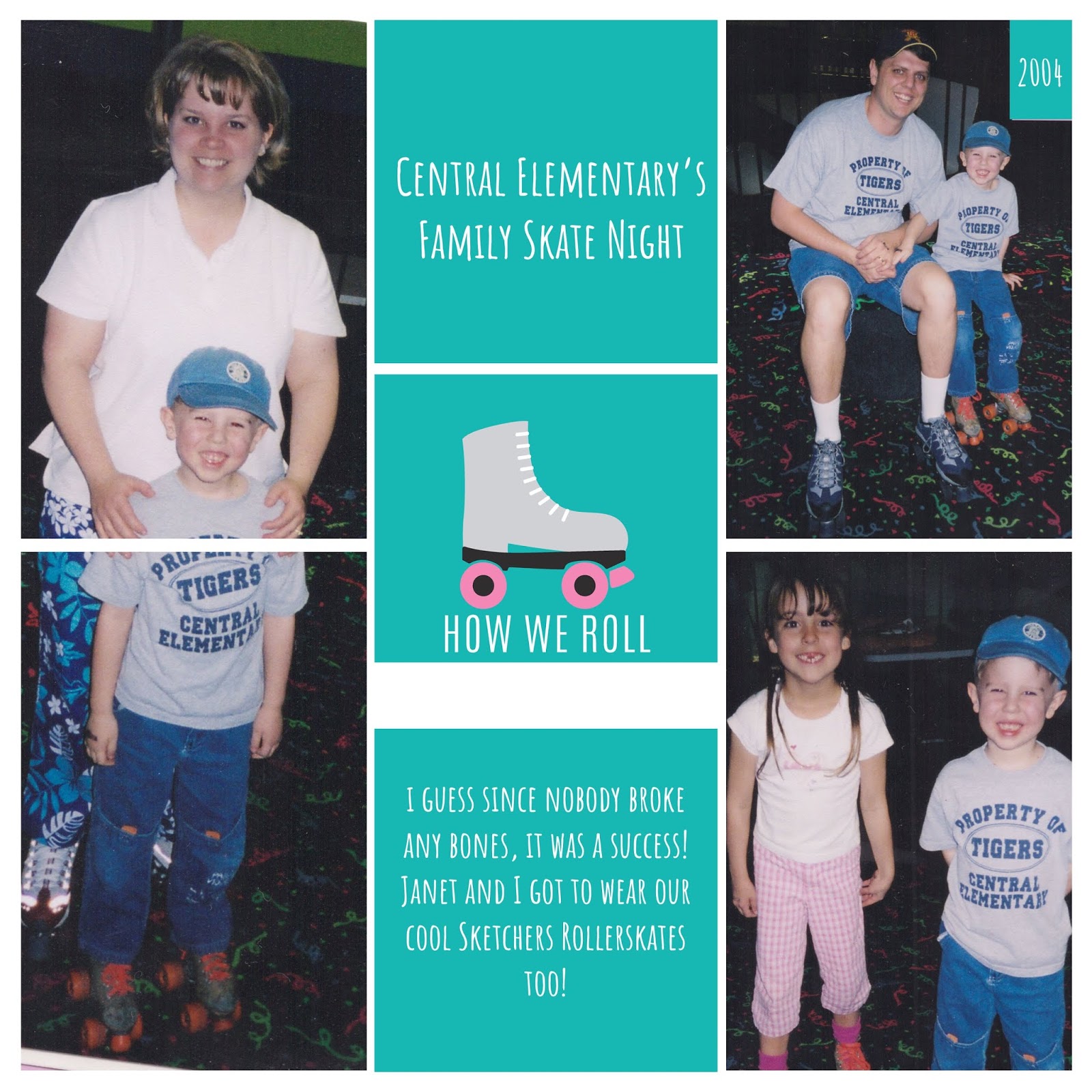
How We Roll...

I know, I know. It's been a couple of weeks since I last posted.

Life, you know. Summer break, non-stop baseball every single night. Busy, busy, busy.

But I have a couple of minutes today, so here goes another page makeover!

First, the original page:


Yep, you see it too, don't you? No journaling.

So I scanned this page and pulled up the Design R Template in the Project Life app. Two of my photos fit pretty well within the large pockets, but because of how I had originally cropped the photo of my wife and son, it was too all and narrow and wouldn't reduce down to fit nicely into a single pocket.  So I enlarged that photo and put it in the two pockets on the left.

Doing this takes a little bit of finesse, since you are pinching and dragging to enlarge the top photo to begin with, and then you have to pinch and drag the EXACT SAME amount to get the bottom part of the photo to line up! It would be so great if there was some sort of percentage or number you could reference after you get the top photo just right (like if when you were done it would say "this photo was enlarged 216%") then you could just enlarge the bottom the same percentage! But no, it's a manual process for sure. 

Just look for things you can line up between the two photos. In this case, I tried to use the design on my wife's pants and my son's shirt sleeves to get it just right.

When it came to the filler cards down the middle, I knew there was a roller skate in the Awesome Edition card set. So I found the one I wanted, and put it in the middle square. 

That middle card is actually a title card, so had a white band for journaling on it.
I put solid teal colored cards in the top and bottom slots and added the missing-from-the-original-page journaling (in a white color) to match the roller skate card. But I needed to get rid of that white band underneath the skate!

I added a Free Form Text box to that roller skate card, and typed a captial "I" in the Raleway font. Then I rotated it onto it's side ( so it was like this ___  ), and then enlarged it so that it covered the white band on the card. Then I changed the color of the font to the same teal color as the card, and effectively "masked" that white band!

Then I changed my background color to the same teal, and DONE!


Oh yeah, one more thing! If you look back at the original page, and the photo of my son and I, you can see that the other picture's cardstock matte is kind of intruding on the space above my son's head. Well, when I pulled that photo into the pocket, you could still see that cardstock corner of the other picture.  So I used the same "I" trick and covered up that cardstock corner, and then added the 2004 text on top of that.

Now it's DONE! :)

Thursday, May 10, 2018

Trick or Treat...

I really don't know how many people even read this, but here is another paper scrapbook page (a two-page spread) that I have worked to convert into a digital, Project Life app page.

The original pages were created waaaaaaaay back at the turn of the century! LOL And they are pretty representative of what scrapbooking was like back then: stickers, cardstock matted photos, and per my usual, NO journaling!


Getting the pictures into slots was pretty straight forward. Even though they were originally glued on the page at an angle, they still worked in the slots (which you'll see in the finished product further below).

In looking through the possible PL app kits to use for the page, of course I looked at the Halloween set, but it was all blacks and oranges, and I knew I wanted to bring in the purple and green colors from the pictures and cardstock matte.  So I sifted through the available kits, looking for the perfect purple and green, and preferably, both in the same kit! 

It didn't take long for me to settle on the Awesome Edition kit. Right shade of purple. Right shade of green. Score!

I was using Design Template D, which has the four 3x4 card slots right down the middle of the page, so I decided to alternate purple, green, purple, green going down, with just plain color cards.

I knew I wanted to duplicate the "title" of the original page that said, "Halloween 2000" but wanted more than just my usual skinny font (I tend to do everything in the Amatic font).

So I picked the Mouse Memoirs font, because it was a little "chunky" and added the word "Halloween" and put it at a 120 font size to take up as much space as possible on the card.

I decided to do this in a FFT (Free Form Text) box, instead of the normal journaling box so I could move it around within the space at will. I put it in white and then moved it to the middle of my purple card. Then I added a second FFT box, repeated the word "Halloween" in the same font, same size, but changed the color to green.


From there, I carefully positioned the green word over the top of my white word, but then just slightly shifted it so that I got a 3D layered effect! This really works well with the chunky fonts--which is the reason I chose it!

Then, I added another FFT text box, and entered a slash ( / ) character and used the little dot button in the bottom right corner to rotate it until is was no longer diagonal, but straight up and down! Then I moved the slash so that it looked like it was a strand of spider web attached to the bottom of one of the "e" letters!

And then I added yet another FFT text box, pulled in a spider emoji, and positioned it so it was dangling from my "web strand" !


One journaling slot down, three to go!

For the next card, I started out with a FFT text box and added the spider web emoji, enlarged it a little bit, and put it in the corner of the card. Then added another FFT text box with a spider emoji and placed it on top of the web. Using emojis in this way is kind of like using digital stickers!

Then I added the journaling onto the green card like normal (no FFT text box) and typed it out, putting in manual hard returns whenever the text was going to run into my web/spider images.


For the next journaling card, I typed out my text, enlarged it to fill the space, and then looked it over. I wanted to accent a couple of the words in the text, so I used a couple of layered FFT text boxes, put a purple (to match my card color) letter "I" and masked (covered up) the words "Mummy" and "Deady" in the original journaling.

That left me with just blank purple space where those words used to be. Then I added two additional FFT text boxes, added the words "Mummy" and "Deady" back in, in the Mouse Memoirs font, and enlarged them to fit the blank spaces!


For the last journaling card, I repeated the 3D layering trick for the year "2000", and wham-o! Another page done!

Now to decide if I like the white borders best...

...or the black? Let me know what you like best in the comments!